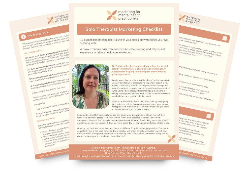
MHM#48 Why consistent colours matter
Sep 29, 2025When asked to describe a brand, people typically respond with “it’s your logo and colours”. And yes, the logo and colours are an important visual component of a brand, but a brand is so much more.
Your brand is the expectations someone has about you. They’re what a client expects when they visit your Instagram page, book an initial free consult, open your newsletter, and book an appointment.
These expectations are created from all their prior experiences and interactions with you. They help prospective clients decide whether to book an initial consultation or appointment with you.
Expectations include things like:
From reading their website, it appears they specialise in working with my specific issues, so in my initial consultation, I expect they’ll truly understand what’s going on for me.
From watching their Instagram videos, it seems like they work with people like me, so in my initial consultation, I expect to have a good rapport, they’ll understand me, and I’ll be accepted just as I am.
They were very calming and reassuring in my initial free consult, so I now know what to expect from a regular therapy session with them.
Positive expectations that are met build huge amounts of trust. And this trust tells them they’re making the right decision to choose you as their therapist.
So, how does your brand’s visual identity fit in?
Even though brand management encompasses much more than your logo, colours, fonts, and images, these visual components of your brand still play a crucial role.
Firstly, because humans respond to visuals on an emotional level. Warm tones may evoke feelings of safety or care. Soft blues and greens often convey a sense of calm and trust. Gentle, earthy hues can evoke a sense of groundedness or a connection to nature. Colours and imagery create feelings. And feelings are everything when someone’s deciding whether you’re the right therapist for them.
Secondly, a key part of successful brand management is recognition. The easier it is for clients to notice you, the more likely they’ll engage with your content. When your reels and graphics on Instagram share consistent colours and style, prospective clients will more easily spot your posts in their feed and pause: “Here’s another post from that therapist, I always find her content inspiring.”
The more content a prospective client consumes, the more familiar and connected they’ll feel with you. Over time, that familiarity builds expectations and trust. And when they’re ready to take the next step, you’ll already feel like the best therapist to help them.
To grow your caseload, trust is everything. And to build trust, your ideal clients need ongoing opportunities to see you, connect with you, and get to know you.
What if you’re hating your logo and colours
Firstly, remember no one is going to analyse and think about your logo as much as you do.
Secondly, most of the time, a complete change of logo and colours does more harm than good. If your Practice is fairly established, a complete change of logo and visual identity will remove all the familiarity and recognition you’ve built up, and you’ll start from scratch.
Thirdly, your logo doesn’t matter as much as you think it does. It’s hard not to feel attached to your logo, but people aren’t forming trust with your logo; they’re forming trust with you. Over time, your logo simply becomes a symbol that reminds them of their experience with you.
Think about a brand like Apple. Their logo has absolutely nothing to do with apple, the fruit. It’s not the image that matters; it’s the expectations built around it. When people see the Apple logo, they think of innovation, iPhones, or potentially the negative experiences they’ve had with Apple products. But no one thinks of Granny Smiths.
If you truly dislike your logo and colours and feel they don’t accurately reflect you and your Practice, my advice is to evolve them, rather than completely change them. Update your logo and slightly adjust the colour palette, but ensure that at a glance, your logo and designs remain recognisable.
Enrolment for Marketing School for Solo Therapists opens 9 September
In Marketing School for Solo Therapists, I’ll guide you through fun, creative exercises to choose your colour palette and font, and design a logo that reflects your Practice’s personality and connects with your ideal clients. Learn more and join the priority list.